Tiny Treasures

Peace of mind for parents with reliable daycare app

Overview

As a child, I remember how chaotic it got for my parents when they were hustling for work. My grandmother used to take care of me when my parents had to work, as the concept of daycare was not known much during that time.

In India, the traditional family structure has changed. More parents are migrating to hubs of job opportunities in metro cities like Bengaluru, Hyderabad, Mumbai, Delhi, and Chennai. There has also been an increase in women's employment, which has led to a rising need for daycare centers, as grandparents and other relatives are no longer available to take care of children. According to a survey done by KLAY Centres for Child Development, 49% of parents rely on daycare facilities in metrocities.

There is a need for apps like 
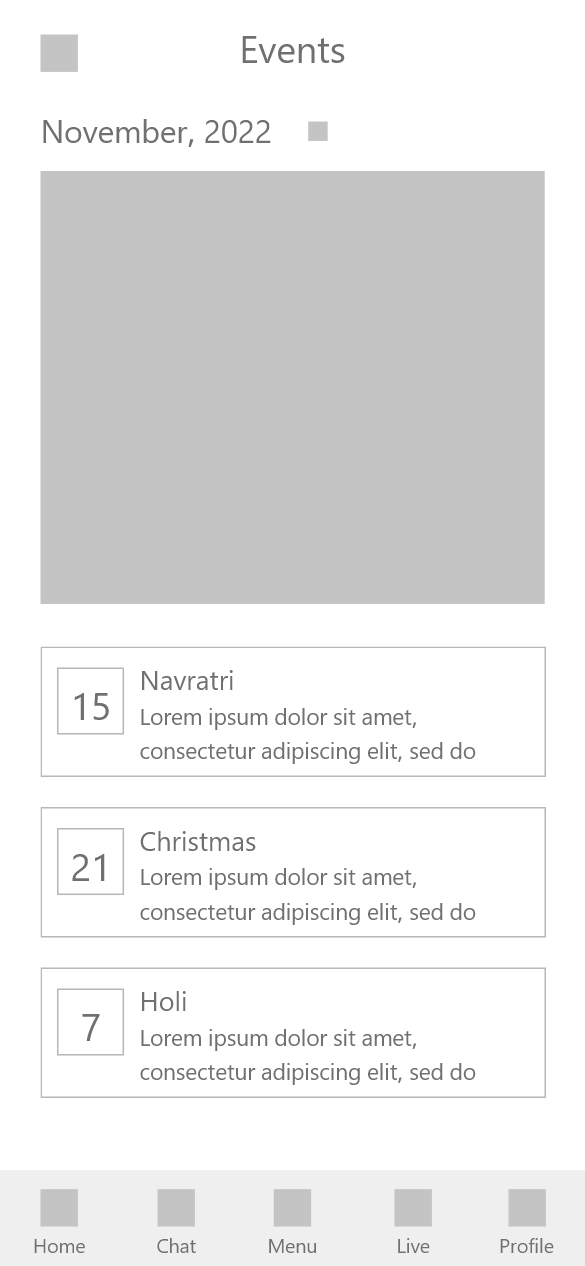
Tiny Treasures, which help parents stay connected with their children while they are at daycare. It helps parents build trust in their daycare providers by providing them with all the information they need to feel confident about their child's care.

My role

UX/UI Designer


User Research, Ideation, Visual design, Wireframing, Prototyping, Usability study

Tools used

Adobe XD, Illustrator, After Effects

Timeline

2022-2023, 4 months

The Problem

Balancing work and childcare is a challenge for many parents. They may have to leave their children in daycare for long hours, which can be emotionally overwhelming for both the parents and the children. Children may have difficulty adjusting to a new environment and miss their parents. Parents worry about the quality of care their children are receiving and may have doubts about trusting daycare centers which results in parents compromising their professional lives.

Ideation

The user's goal is to stay connected with their children while they are away, and the aim of the app is to build trust between parents and daycare providers. When exploring solutions, the following considerations were kept in mind:

Real time updates

Users can get real time updates on food, sleep, etc. & can continuously monitor through live steaming

Direct communication

Users can directly communicate with caregivers and other parents in chats

Secure check in/out

The app ensures safety of children with strong check in/out security measures

Schedule time table

Users can customize their child's daycare schedule to ease the transition.

Staff info

Users can verify the credentials and experience of the staff in the staff info section

Monthly reports

Users can use health and progress reports to track their child's development and identify concerns

Information architecture

Initially I though that linking everything on the home page would provide easy access to users, but later during usability tests I found the purpose of home page was not to access everything
To ensure security of children, I tried out various options for check out flow

Concept wireframes

Before starting on digital wireframes, I iterated with few sketches of page layouts.

Lo-Fi wireframes

Once the structure was established, I started creating low-fidelity wireframes. These wireframes were later converted to lo-fi prototypes to get a better idea for how all the screens would fit together with smooth transition.

Usability Testing

Before moving on to high-fidelity mock ups, tested the lo-fi prototype with five users and used two methods: observational session and interview.

The test objectives focused on the usability of features and safe login, checkout.

User tasks

  • Login and check out your child
  • Set remainder of one of the notifications
  • Check if you have entered correct blood group of your Yash
  • Check daily report
  • Edit time table of your child
Follow up : How easy or difficult were these tasks to complete? Is there anything you would change?

Issues found were

  • 3/5 users couldn't find set remainder button in notifications
  • 2/5 users confused the profiles of children with stories on home page
  • 2/5 users couldn’t find daily report and suggested that it was important & needed a more easier access
  • 4/5 users found navigation on home page easy to use

Solution

During usability study, I found that parents wanted to have an idea of what their child's day looked like and what all activities they did during their time at day care. So I decided to add summary of their child's day.

I used usability study feedback to iteratively design high-fidelity mockups, user test them, and generate an interactive prototype of the final user flow. While designing, I kept easy access to features, detailed information of children and engaging UI in mind.

Login easily & see how your child's day looks like!

Users can easily get detailed updates about their child's day, view their activities & stay connected with them

View staff information and reach out to them easily

Users can view center details, check staff details, and reach out to them without difficulty

Ensure your child's safety by secure check out

Users can check out their child from daycare simply by asking a staff member to scan QR code generated in parent’s device

UI Design

The final color palette incorporates bright purple. I chose purple as the primary color because it is cheerful and playful. I intuitively chose complementary colors and finalized them using WCAG contrast ratios.

For text, I chose Quicksand as my main font because of its soft feel due to its rounded corners and overall simplicity and legibility.

Conclusion

Learnings

  • Empathizing with users: Empathizing with users allowed me to understand their pain points. For this project, parents' primary concern is their children's safety, so I prioritized building a trustworthy and reliable app.
  • Defining the boundaries: At first, I began this project without setting clear boundaries. But I soon recognized the importance of specifying the children's age group, user context, and narrowing down user groups to create a more user-oriented product.
  • Prioritizing: Initially, I planned to include an in-app search feature for daycare centers. However, after consulting with a developer, I realized it would overly complicate the MVP, requiring a dedicated search engine and on-site verification.
  • Design is a non-linear process: I employed the design thinking process for this project, but it wasn't a linear journey. I often revisited research, adjusted information architecture, and redesigned the prototype. This iterative approach ultimately led to a more refined version of the product.
  • Importance of collaboration: Collaborating with developer and taking suggestions really helped to improve my designs and make the project more realistic.

Next steps

This website can be made more user oriented by conducting another round of usability studies. The design focus should be expanded beyond parents to include staff members and admins. Additionally, a different use case for providing information about policies, standards, and educational blogs on the website can be explored.

Makes me little more confident leaving my child in daycare
Ruchita Patel, Interior designer

Thanks for reading!

More Projects

Income Tax Mobile App
Quicko Tools and Calculators
Tools Landing Page
Good Foods
Aalay