Good Foods

Convenient grocery shopping app for customers

Overview

Good Foods is a local grocery store based in Ahmedabad. They are known for their quality, price, and range of products. Up until now, they have traditionally sold groceries in offline mode. However, they are now looking to expand their business online and get involved in the online shopping and delivery experience by creating a grocery shopping app.

The Good Foods app helps customers to quickly and easily shop for groceries from the comfort of their own homes and allow them to easily pick up or have them delivered hassle-free.

My role

UX/UI Designer


User Research, Competitive analysis, Ideation, Visual design, Design System, Wireframing, Prototyping, Usability study

Tools used

Figma, Photoshop

Timeline

2022, 3 months

The Problem

Consumers at Good Foods store have to spend a long time navigating crowded aisles and waiting in long checkout lines. This has led to many consumers complaining about the store's service, as well as the crowding and the difficulty of carrying heavy grocery bags to the parking lot. This causes frustration for both consumers and staff and damages the store's reputation and leads to lost of business

Research

Who are the users

Firstly, I identified common user groups for grocery shopping app for Good Foods
Working Professionals
XStudentsX
XFamiliesX
Elderly/Differently abled Individuals

What users said

Then, to understand why consumers shopped at Good Foods, I interviewed four consumers and asked why they preferred Good Foods in the era of instant delivery platforms. The major issues they mentioned about these platforms were high delivery charges, the unavailability of local brands, inaccurate product descriptions, and a lack of personalization.

They trusted Good Foods for its quality, range of products, and its ability to cater to their personalization requirements.

Survey

I conducted a small survey with 13 consumers regarding the problems faced by them in grocery shopping at Good Foods store. The findings revealed
80% consumers find difficult to visit store due to busy work schedule
50% consumers believe that they can’t browse whole range of products at store offline
50% consumers feel that they have limited product information while ordering on call
42% consumers are hesitant sharing their address to strangers for delivery
View survey report

Insights

I gathered insights based on the research of grocery shopping process and grouped it together. This led to three clusters that gave me an understanding of the most common pain points regarding grocery shopping

Accessibility

  • Physical barriers like narrow aisles, crowd, etc at store can be difficult to navigate
  • Checkout process at store is hectic sometimes

Time factor

  • Grocery stores can become very crowded, leading to long waiting lines
  • Grocery stores may have limited hours of operation
  • Store may not delivery the products according to consumer’s schedule

Security

  • Consumers may not trust giving their address to strangers for delivery
  • Delivery theft concern regarding packages being stolen or left unattended

User personas

Moving to the next step, I created personas based on the user groups and user research which helped me developing a clear understanding of who I was designing for. I referred to these personas through the entire designing process to remain focused when making design decisions.

Developing empathy

Now, to see the world through the consumer's eyes and understand their perspective, I created an empathy map, which revealed that users are often confused while shopping for groceries.

Competitor analysis

While the research findings allowed me to narrow down the problem, I needed some inspiration before I started ideation. I took a look at some of our direct and indirect competitors to get new perspectives
View full report

Ideation

The user's goal is to shop for groceries and pick or have them delivered hassle-free. When exploring solutions, the following considerations were kept in mind:

Voice and Image Search

Searching is made easier for users with accessibility needs by voice and image search

Delivery person verification

To ensure safety, users can verify the delivery person before delivery and schedule grocery deliveries to their convenience

Scheduled pick up

For convenience, users can arrange the pickup time according to their schedule

User flows

The user journey in the grocery ordering experience consists of 3 main phases

Discovery

Decision

Ordering

Concept wireframes

Before starting on digital wireframes, I iterated with few sketches of page layouts.

Lo-Fi wireframes

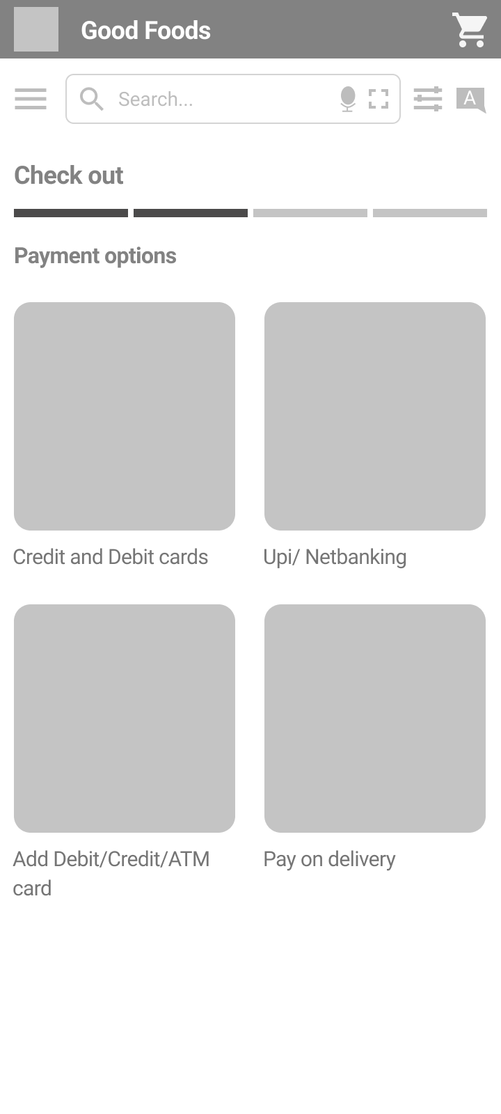
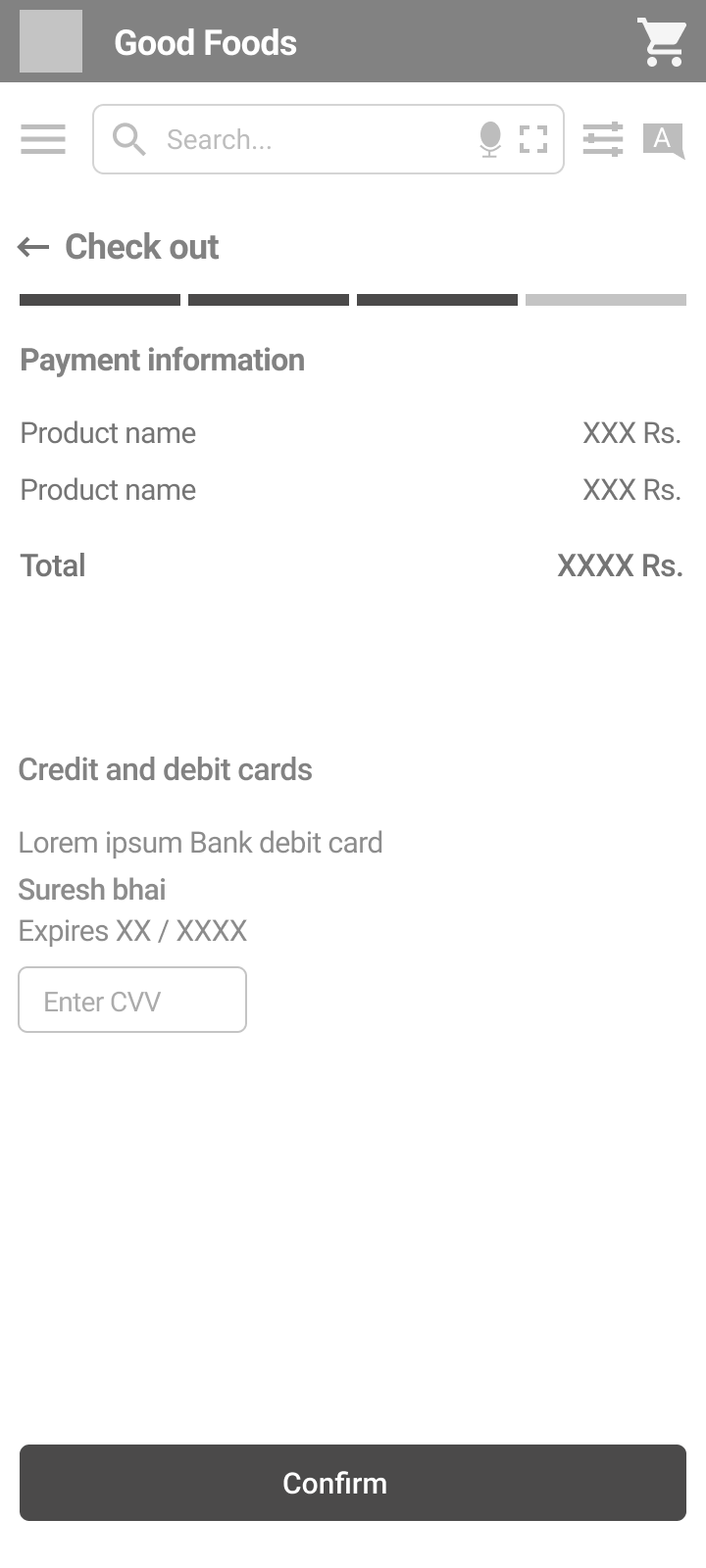
Once the structure was established, I started creating low-fidelity wireframes. These wireframes were later converted to lo-fi prototypes to get a better idea for how all the screens would fit together with smooth transition

Usability Testing

Before moving on to high-fidelity mock ups, I tested the lo-fi prototype with five users and used two methods: observational session and interview.

The test objectives focused on usability of features, smooth searching and easy check out.

User tasks

  • From the home screen, create an account.
  • Find fortune biryani sp rice and add to cart
  • Complete the check out process
  • Verify a delivery man
  • Confirm your order and complete the checkout process
Follow up : How easy or difficult were these tasks to complete? Is there anything you would change?

Although users completed tasks, some issues were

  • Users found the categories page too long to scroll through
  • Users were confused in comparison of products
  • Users were unsure of the next action after adding an item to their cart
  • Users wanted detail breakup of their total amount
System usability scale

Solution

With the usability study feedback and survey, I created various iterations of high-fidelity mockups and generated an interactive prototype of the final user flow. While designing, I kept easy navigation in mind.

Find your items quickly and easily

Users can easily find the right product by searching for it in the search bar or browsing the categories and subcategories

View product details and fill your cart

Users can effortlessly view details such as images, quantities available, prices, discounts, compare with other products, and add items to cart

Choose your handover option and checkout with ease

Users can choose to pick up groceries or have them delivered, verify details, make a smooth payment, and check out easily

UI Design

Conclusion

Learnings

Good Foods app, being my first UX project taught me a lot.

Through this project, I learned Design Thinking process. I learned to design an e-commerce app  a variety of user groups. I also learned that feedback plays a crucial role in user experience design. Taking feedback from users and other stakeholders helps to identify areas for improvement.

Next steps

To make the app more user-oriented, other rounds of usability studies can be conducted. These studies will validate whether the pain points users experienced have been effectively addressed.

The store owner told me they also have bulk orders for grocery kits and restaurant orders. These use cases could be explored. Additionally, a website version of Good Foods can be designed so that users can order from devices other than mobile phones. The design focus also needs to be expanded beyond consumers to include store owners as a user group and design for admins.

I am more likely to trust a delivery person if I have prior information about them
Pankaj Shah, Retired business analyst

Thanks for reading!

More Projects

Income Tax Mobile App
Quicko Tools and Calculators
Tiny Treasures
Tools Landing Page
Aalay